App Branding
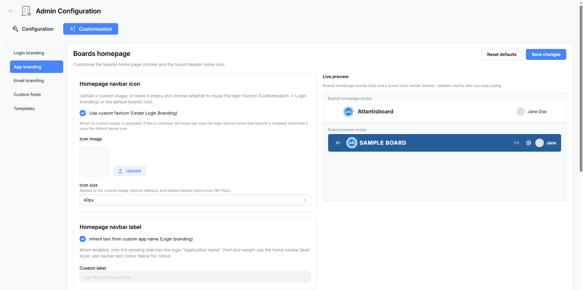
The App Branding panel controls the look of the in-application experience — the homepage navbar, board navbar icon, homepage background, and default UI font. A live preview updates as you make changes so you can see the result before saving.
Navigate to Admin → Customisation → App Branding to open the panel.
Live Preview
The right side of the panel shows a real-time preview with two example navbars — a homepage-style navbar and a board-style navbar — rendered with your current settings. The preview updates shortly after you stop typing or pick a new colour.

Homepage Navbar Icon
Control the icon displayed at the far left of the homepage navigation bar.
| Setting | Type | Description |
|---|---|---|
| Use custom favicon | Checkbox | When checked, the navbar icon inherits the favicon uploaded in Login Branding. This is a quick way to share a single icon across the login page and the app. |
| Custom navbar icon | File upload | Upload a dedicated navbar icon. Accepted formats: PNG, JPEG, WebP, SVG. Maximum file size: 5 MB. |
| Icon size | Slider | Adjustable from 18 to 75 px in 1 px increments. |
If neither option is configured, the default Atlantisboard icon is shown.
Homepage Navbar Label
The text displayed next to the navbar icon.
| Setting | Type | Description |
|---|---|---|
| Inherit text from custom app name | Checkbox | When checked, the label automatically uses the application name configured in Login Branding. |
| Custom label | Text input | Enter a custom label when not inheriting from Login Branding (e.g. “Team Hub”, “Project Tracker”). |
Homepage Navbar Colours
| Setting | Type | Default | Description |
|---|---|---|---|
| Text colour | Colour picker | #212529 |
Colour of the navbar label text and icons. |
| Background colour | Colour picker | #ffffff |
Background colour of the homepage navbar. |
Homepage Background
Control what appears behind the workspace and board tiles on the home page.
| Setting | Type | Default | Description |
|---|---|---|---|
| Mode | Selector | Background Colour | Choose between Background Colour and Background Image. |
| Page background colour | Colour picker | #f8f9fa |
Solid background colour (used when mode is set to Background Colour). |
| Background image | File upload | — | Upload an image to use as the homepage background. Accepted formats: PNG, JPEG, WebP. Maximum file size: 10 MB. Images are auto-resized to a maximum edge of 2 400 px to optimise loading performance. |
Board Navbar Icon
The icon shown in the navigation bar when a user is inside a board.
| Setting | Type | Description |
|---|---|---|
| Use same icon as homepage navbar | Checkbox | When checked, the board navbar uses the same icon configured for the homepage navbar. |
| Board icon upload | File upload | Upload a separate icon for the board navbar. This upload is disabled when the “same as home” checkbox is checked. |
| Icon size | Slider | Adjustable from 18 to 75 px in 1 px increments. |
Default UI Font
Select the default font used across the entire Atlantisboard interface.
| Option | Description |
|---|---|
| System UI | Uses the operating system’s default font stack. |
| Poppins | The built-in Atlantisboard font — a clean, modern sans-serif. |
| Custom fonts | Any fonts you have uploaded via the Custom Fonts panel appear here as additional options. |
The selected font applies to all UI text throughout the application (navigation, buttons, labels, form fields, etc.). Individual branding elements (login app name, tagline) have their own font overrides configured in Login Branding.
Saving and Resetting
- Save Changes — Persists all current settings. Changes take effect immediately for all users.
- Reset Defaults — Opens a confirmation modal, then restores all App Branding settings to their factory defaults. This removes uploaded icons and background images and resets all colours and font selections.
Related Pages
- Login Branding — customise the login and registration pages.
- Email Branding — customise outgoing email templates.
- Custom Fonts — upload fonts available in the UI font selector.