Cards
Cards are the fundamental units of work in Atlantisboard. Each card represents a task, idea, or item within a list. On the board, cards appear as compact preview tiles that surface key information at a glance.
Creating a Card
- Open a board and locate the list where you want to add the card.
- Click the Add card button (located at the top or bottom of the list, depending on your List Settings configuration for default card position).
- Type a title for the card and press Enter or click the confirm button.
The card appears immediately in the list and is synced to all connected users in real time.
Card Preview Anatomy
Each card on the board displays a compact preview with several visual elements. Most of these can be individually toggled on or off from Board Settings → Card Settings.
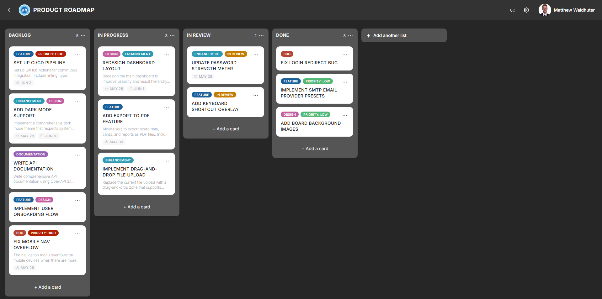
Visual Elements
From top to bottom, a card preview can show:
| Element | Description | Toggleable |
|---|---|---|
| Cover image | A selected attachment image displayed at the top of the card. | — |
| Colour stripe / tint | A background colour applied to the card, useful for visual categorisation. | — |
| Title | The card’s name, with emoji rendering support. Always visible. | No |
| Label colour chips | Small coloured rectangles representing assigned labels. | Yes |
| Description indicator | Either a 2-line text preview of the description or a small icon indicating a description exists. | Yes |
| Date badges | Start date, due date, and end date with icons and status colours (upcoming, overdue, complete). | Yes (per date type) |
| Assignee avatars | Profile pictures of assigned members (up to 4 shown, with a +N overflow indicator for additional assignees). |
Yes |
| Checklist progress | A progress bar or fraction showing completed vs. total checklist items. | Yes |
| Attachment count | A paperclip icon with the number of attached files. | Yes |
| Comment count | A speech-bubble icon with the number of comments. | Yes |

Date Badge Colours
Date badges use colour coding to communicate urgency:
- Default — the date is in the future and not yet approaching.
- Upcoming — the due date is approaching soon (visual highlight).
- Overdue — the due date has passed without the card being marked complete (red/warning colour).
- Complete — the card has been marked as done (green/success colour).
Opening a Card
Click anywhere on a card preview to open the full Card Detail modal, where you can edit all card properties — description, dates, checklists, comments, attachments, and more.
Card Context Menu
Each card has a three-dot button (visible on hover on desktop, or via long-press on mobile) that opens a quick-access context menu with actions such as:
- Set card colour — apply a background colour tint.
- Rename — edit the card title inline.
- Quick actions — shortcuts to common operations without opening the full detail modal.
Card Size
Cards can be displayed in two sizes, configurable in Board Settings → Card Settings:
- Small — compact cards with minimal padding, ideal for boards with many cards.
- Medium — slightly more spacious cards with more room for badge elements.
Related Pages
- Card Detail — the full card editing experience with descriptions, checklists, comments, and more.
- Lists & Columns — the lists that contain cards.
- Drag & Drop — moving cards between lists.
- Board Settings: Card Settings — toggle which badge elements appear on card previews.