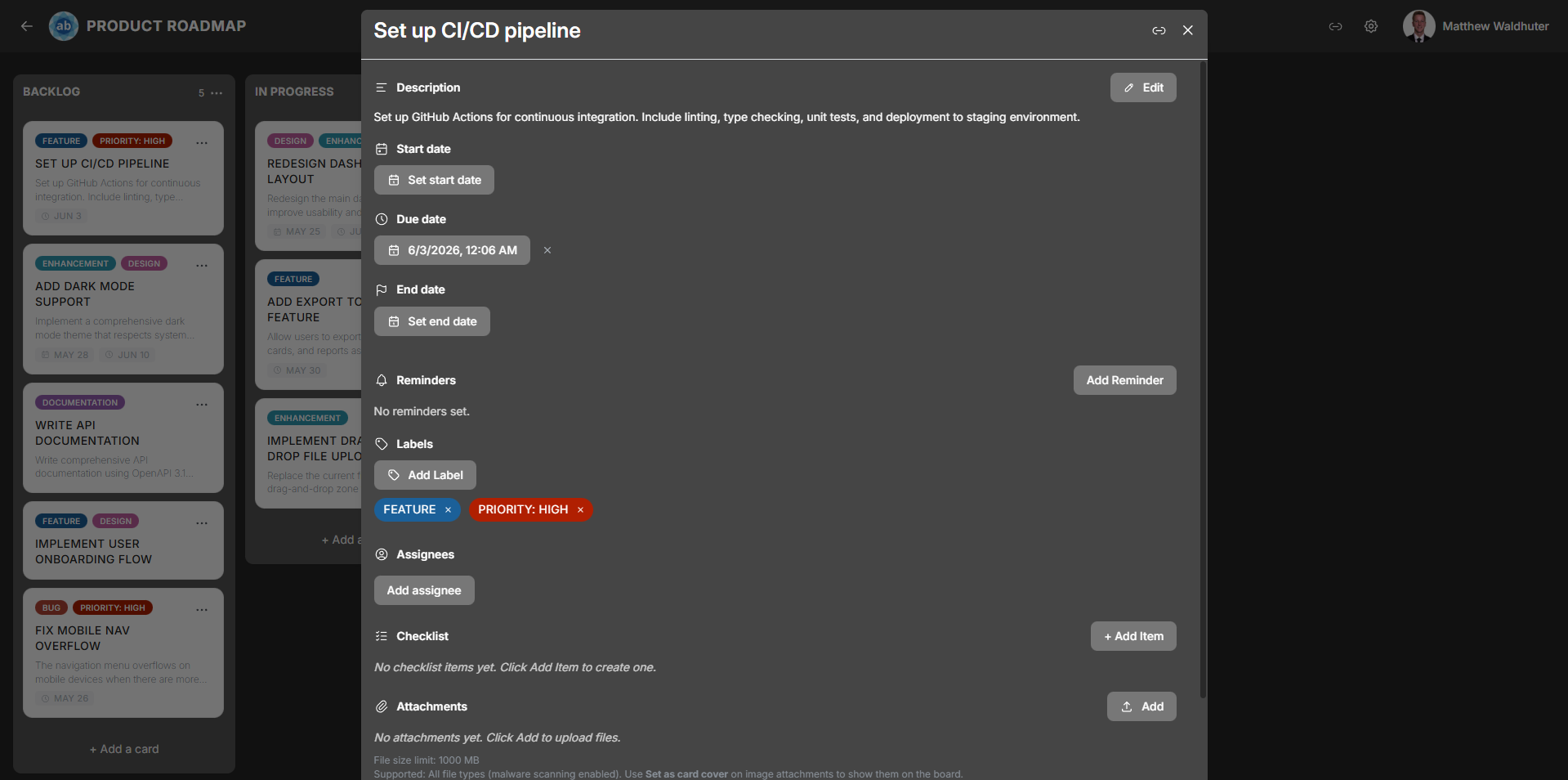
Card Detail
The card detail modal is where you manage everything about a card. Open it by clicking any card on the board. The modal provides a comprehensive editing experience with sections for descriptions, dates, checklists, comments, attachments, and more.
Title
The card title appears at the top of the modal. Click it to edit inline — type your changes and click away or press Enter to save. The title supports emoji rendering.
Description
The description field uses a rich-text editor powered by Tiptap with full Markdown support.

Formatting Options
The formatting toolbar includes:
- Bold, italic, strikethrough, and underline
- Headings (multiple levels)
- Bullet lists and numbered lists
- Code (inline) and code blocks with syntax highlighting (powered by Lowlight)
- Links — paste or type URLs
- Emoji picker — insert emoji directly into the text
- Inline button extension — add interactive button elements
The editor saves automatically. Other users see description changes reflected in real time.
Dates
Cards support three independent date fields, each with a date and time picker:
| Date Field | Permission Gate | Purpose |
|---|---|---|
| Start Date | cards.dates.start.edit |
When work on this card is scheduled to begin. |
| Due Date | cards.dates.due.edit |
The deadline for the card. Displays status colours: upcoming (approaching), overdue (past due), or complete. |
| End Date | cards.dates.end.edit |
When work was actually completed or the card was closed. |
Each date can be set or cleared independently. Date badges appear on the card preview on the board (toggleable in Card Settings).
Reminders
Reminders let you receive notifications about upcoming card deadlines. Each card supports up to 3 reminders, tied to the card’s due date.

Each reminder includes:
- Trigger time — when the reminder fires (e.g., 15 minutes before, 1 hour before, 1 day before, or a specific date and time).
- Repeat frequency — optionally repeat the reminder at a set interval.
- Status — sent or dismissed.
Managing Reminders
- Add a reminder from the card detail modal.
- Edit the trigger time or repeat frequency.
- Dismiss a reminder after it fires.
- Delete a reminder you no longer need.
Reminders are delivered as push notifications (if configured — see Notification Preferences) and as in-app notifications.
Labels
Labels are colour-coded tags for categorising cards. From the card detail modal:
- Add labels — select from the board’s available label set.
- Remove labels — click an applied label to remove it.
- Labels are managed at the board level via Board Settings → Labels.
Label chips appear on the card preview on the board when the “Labels” toggle is enabled in Card Settings.
Assignees
Assign board members to the card to indicate responsibility:
- Assign — search for and select board members from the assignee picker.
- Unassign — remove a member from the card.
- Assignee avatars appear on the card preview (up to 4 shown, with a
+Noverflow indicator).
Checklists
Cards can have multiple named checklists, each containing a series of items.

Working with Checklists
| Action | Description |
|---|---|
| Add a checklist | Create a new named checklist on the card. |
| Add items | Type items into a checklist. Each item has a checkbox. |
| Check / uncheck items | Toggle completion. A completion timestamp is recorded. |
| Reorder items | Drag items within a checklist to rearrange them. |
| Progress bar | Each checklist shows a visual progress bar indicating completed vs. total items. |
| Delete items | Remove individual items from a checklist. |
| Delete a checklist | Remove an entire checklist and all its items. |
The overall checklist progress indicator is displayed on the card preview on the board (toggleable in Card Settings).
Comments
The comments section supports threaded discussion on a card.

- Add a comment — type in the comment field and click Save.
- Delete your own comments, or delete others’ comments if you have the
comments.deletepermission. - Real-time sync — when another user adds or deletes a comment, your open card detail updates automatically (you do not see text while they are still typing).
- Each comment displays the author avatar, author name, and timestamp.
Attachments
Upload and manage files attached to a card.

| Feature | Details |
|---|---|
| Upload | Drag and drop files onto the card detail, or use the file picker button. |
| Malware scan | Uploads are scanned with ClamAV before storage. On servers with ≥ 2 GB available RAM, scanning uses an in-container clamd daemon (higher RAM use, faster repeat scans); below that threshold scans run on-demand via clamscan. |
| Size limit | Configurable via the CARD_ATTACHMENT_MAX_MB environment variable (default: 50 MB). |
| Attachment list | Displays all attached files with filenames and download links. |
| Image previews | Image attachments show inline thumbnail previews. |
| Download | Click the download icon to save an attachment to your device. |
| Delete | Remove an attachment from the card (requires appropriate permission). |
| Import placeholders | Attachments from board imports may appear as placeholders until the original files are re-uploaded. |
Card Cover
You can set any image attachment as the card’s cover image. The cover appears at the top of the card preview on the board, giving a visual identity to the card.
- Set a cover by selecting an image attachment within the card detail modal.
- Remove the cover to return to the standard card appearance.
Card Colour
Apply a background colour tint to the card. This colour appears both on the card preview on the board and as a header tint in the card detail modal. Useful for visual categorisation beyond labels.
Activity Feed
The activity feed is a chronological log at the bottom of the card detail modal. It records all changes made to the card, including:
- Title and description edits
- Date changes
- Label additions and removals
- Assignee changes
- Checklist modifications
- Attachment uploads and deletions
- Card moves between lists
Each entry shows the actor, the action, and a timestamp.
Additional Actions
Duplicate Card
Copy the card (including its title, description, labels, and checklists) to a target list within the same board.
Delete Card
Permanently remove the card and all its associated data (comments, attachments, checklists). A confirmation dialog is shown before deletion.
Mobile Gestures
On mobile devices, swipe down on the card detail modal to close it and return to the board view.
Related Pages
- Cards — card previews and creating cards on the board.
- Board Settings: Card Settings — toggle which elements appear on card previews.
- Filtering & Search — find cards by label, member, or due date.
- Real-Time Collaboration — how changes sync across users.