Board Overview
When you open a board, you enter a dedicated workspace for managing tasks across lists and cards. This page describes the anatomy of the board view, how to navigate it, and how it adapts across devices.
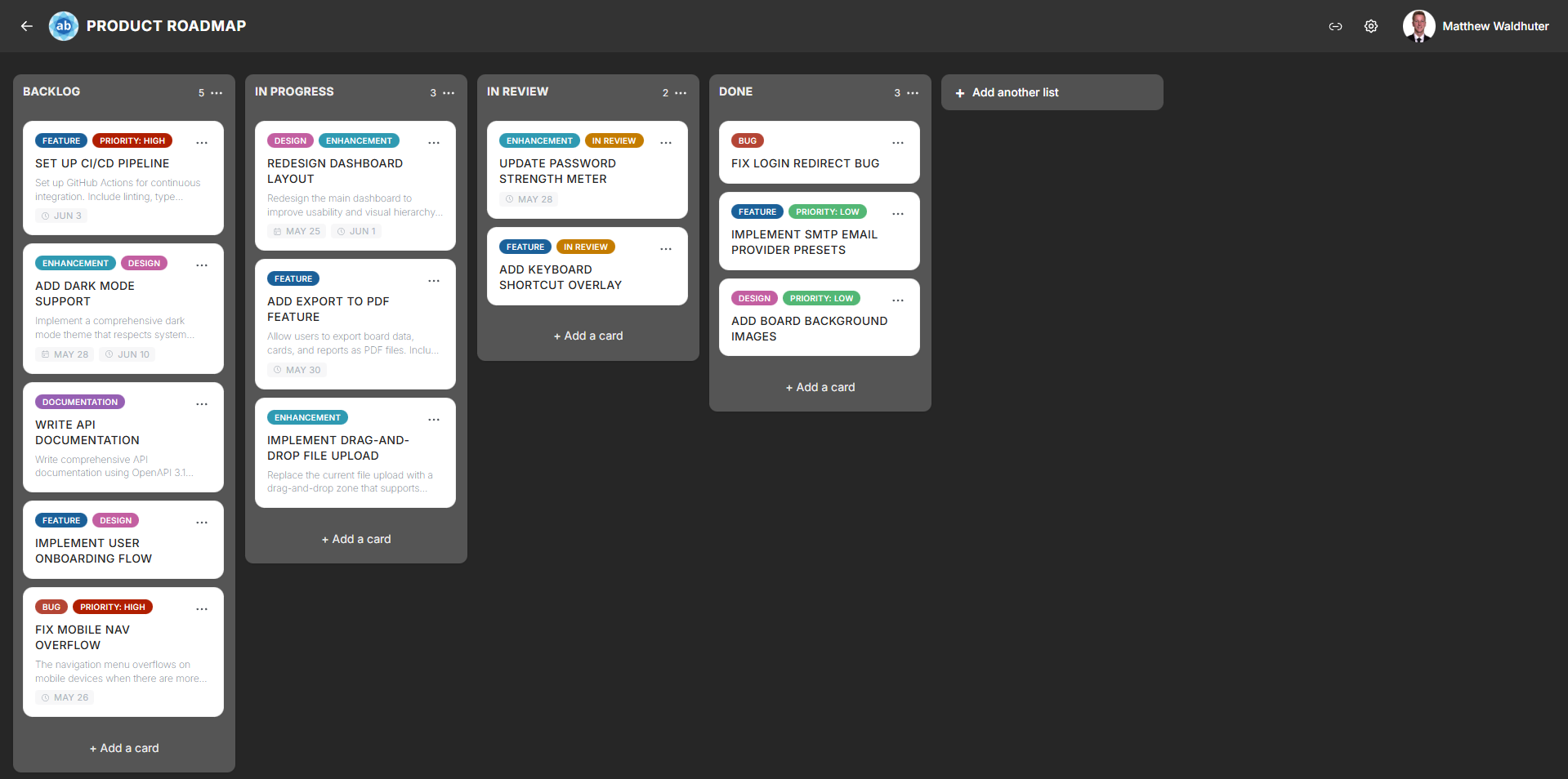
Board Page Layout
The board page is divided into two primary zones:
- Board navbar — a horizontal bar at the top of the screen.
- Board canvas — the main content area with horizontally scrollable list columns and their cards.
Board Navbar
The board navbar provides quick access to board-level actions and information.

From left to right, the navbar includes:
| Element | Description |
|---|---|
| Back button | Returns you to the home page. |
| Brand icon | Displays the board-specific icon (customisable via App Branding). Click to return home. |
| Board title | The name of the current board. Click to edit (if you have permission). |
| Offline notice | No badge while online. When offline, a persistent notification warns that changes will not be saved. See Offline & PWA. |
| Invites button | Opens the Invites & Sharing modal for creating and managing invite links. |
| Settings button | Opens Board Settings (gear icon). |
| User menu avatar | Your profile avatar — click for account options and sign-out. |
Board Canvas
Below the navbar, the board canvas contains all your lists arranged side by side in horizontal columns:
- Horizontal scrolling — scroll left and right to navigate between lists. Boards with many lists benefit from horizontal virtualisation, which renders only the visible columns for optimal performance.
- Vertical scrolling — each list scrolls independently, so you can browse long lists of cards without affecting other columns.
- Add list button — located at the far end of the list row (left or right, depending on your List Settings configuration), allowing you to create new lists.
Scroll Zones
The board canvas includes auto-scroll zones at the left and right edges. When you drag a card or list near the edge of the screen, the board automatically scrolls in that direction to help you reach off-screen lists. See Drag & Drop for more details.
Loading and Sync
When a board first loads, you may briefly see a loading state while data is fetched from the server. Once loaded:
- Real-time sync — changes made by other users appear instantly thanks to MongoDB Change Streams and Socket.io.
- Offline notice — when the network or server is unreachable, a persistent notification warns you; there is no “live” badge while connected. The client automatically attempts to reconnect in the background. See Real-Time Collaboration and Offline & PWA.
Responsive Layout
The board adapts its layout depending on your device:
Desktop
- Lists are displayed as side-by-side columns with generous widths.
- The navbar shows all elements inline.
- Horizontal scrolling via trackpad, scroll wheel (with shift), or the auto-scroll drag zones.
Tablet
- Lists remain as columns but may be slightly narrower.
- Touch scrolling is fully supported for both horizontal and vertical navigation.
Mobile
- Lists are still arranged horizontally, but each column typically fills most of the screen width.
- Swipe left and right to move between lists.
- The navbar condenses — some elements may move into overflow menus.
- Card interactions use touch gestures (long-press to drag, tap to open).
Related Pages
- Lists & Columns — creating, renaming, and configuring lists.
- Cards — card previews and creating cards.
- Drag & Drop — moving cards and lists.
- Real-Time Collaboration — how live updates work.
- Board Settings: Card Settings — toggle card metadata visibility.
- Board Settings: List Settings — configure list width and WIP limits.